Would more COVID testing uncover more COVID positive cases?
It is alleged that India is not testing enough. The number of tests per million population in India stands at around 100 when compared against countries like USA which stands at 6300, or Italy which stands at 12000, or Switzerland which is around 19000 tests per million population.
So, is it that because India is testing lesser number of people per million population, India is reporting less number of cases? Would more testing lead to uncovering of more cases, increasing India's infected count?
Ashish Chandorkar, in this Swarajya magazine article disagrees. Rightly so. He states:
"What does the data tell us?
In India, out of the 100 high risk cases being tested for COVID-19, only 4 are testing positive.
Of those testing positive, roughly sixty per cent are either individuals who traveled from a foreign location or were part of the single source Delhi Nizamuddin congregation.
The positive cases per 100 tests is 17 in the USA, 19 in Italy, 23 in the UK, 24 in France and 37 in Spain.
What does this tell us?
That in spite of the fact that the USA has done more than 16 lakh tests and Italy has had more than 6.5 lakh tests, there is a need for more testing as a large fraction of people are turning to be COVID-19 positive.
Testing in itself is not a panacea to all the problems being associated with COVID-19. Testing for testing’s sake is of no use. Testing should be done for identification and for quarantine."
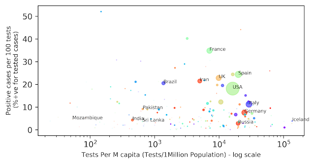
While that was my hunch too for long, and I agree with Ashish, I still thought of running the numbers quickly and plotted a scatter bubble for all data available for all countries across the world. Here it is:
(A note here: We are talking about percentage of cases, not absolute numbers. While more testing will lead to more absolute numbers, the percentage positive would remain mostly a constant)
(A note here: We are talking about percentage of cases, not absolute numbers. While more testing will lead to more absolute numbers, the percentage positive would remain mostly a constant)
 |
| COVID Testing - Would more testing help? |
It's always tricky to explain a plot unless the intuition autoclicks for the onlooker.
On the X axis you have the Tests per million on log scale. On the Y axis you have % of tests that turned out positive. No country reports that all tests conducted were found COVID positive. France comes close to a point where 1 in every 2 tests return positive. In India for every 25 people tested, one returns COVID positive. For USA it is one positive in five tests and so on for all countries as one can see.
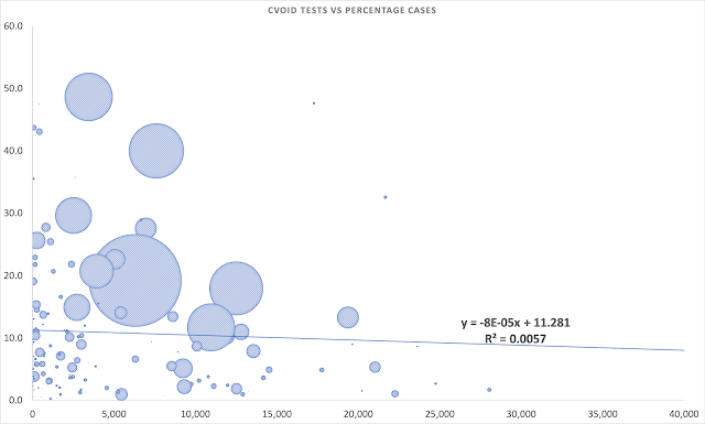
One may note that there is no correlation between percentage detection and per capita testing. It means that wider coverage won't necessarily lead to more detection of cases. To be sure, I have also plotted a best line fit which has almost no slope (slightly negative to be precise). This can be seen below (with a pinch of salt due to the Rsquared value):
 |
| COVID Testing: Relation: Test success percentage(Y) vs More Per M capital Testing (X) |
So, the data supports the theory that more testing won't help unless we have more infections in reality. By testing more, we will just go where Iceland is currently in the first plot. They are testing huge numbers with the resultant same level of success that we have in terms of percentage. We shall move on X axis without any change in Y.
The data so far for India says that the infection level (on per capita terms) is very low, and there is not much transmission on the scale seen in other countries. When we juxtapose against the fact that India has been testing high potential cases (foreign returns, NZ contacts, first level contacts etc.) and still returning negative results, it bears all the more testimony that probably our level of testing is not to be blamed for low numbers. And if that is so, we have reasons to cheer. Either the lockdown has worked, or other factors such as malaria resistant people, hot/humid weather, demographic profile, inbuilt resistance etc is at work.
The plot would also be interesting to watch over time for another reason. If the position of a country on Y axis doesn't change over time, or with increased testing, it would prove that a country exists with a certain tolerance for the infection/spreading which is a function of factors other than testing. Once unmasked, this factor would tell us what might further help.
Above plot were generated on 8th April 2020.
Updated figure as on 16 April is below: The point has just moved right. I won't be surprised if it goes and touches Iceland one day.
 |
| COVID percentage detection has not changed for India - As on 16 April 2020 |
Updated figure as on 26 April is below: The point has just moved right as we have increased the number of test per million from around 200 ten days ago to around 450 currently. It's moving horizontally as expected.
 | |
|
Updated figure as on 03 May 2020 is below: One million tests completed for India. A Milestone reached today. The point has just moved right as we have increased the number of test per million from around 450 a week ago to around 800 currently. It's moving horizontally as expected.
Updated figure as on 10 May 2020 is below: The point has just moved right as we have increased the number of test per million from around 800 a week ago to more than 1000 currently. It's moving horizontally as expected.
Updated figure as on 31 May 2020 is below: The point has just moved right as we have increased the number of test per million from around 1000 in the previous figure to more than 2800 currently. It's moving horizontally as expected. However, there is a slight bump in Y axis by roughly around a percent (4% moves to 5%)
Updated figure as on 20 July 2020 is below: The point has just moved right as we have increased the number of test per million from around 2800 in the previous figure to more than 10000 currently. It's not moving horizontally as expected and for the first time I see a slight vertical movement too. From 5% it is gone upto around 9%. Still much lower than 50% that some countries demonstrate but a movement up nevertheless. I would change my mind about the theory if it goes above 15%.
(Note: All data taken from Worldometer. I have placed the code for generating the labelled bubble plot at https://github.com/tirumalakv/COVID19plot.git to tinker around if you are interested. The plot with the regression line was generated on MS Excel)


Thanks for sharing! good to see someone is posting quality information. Its quite different from other posts. If u looking for more updates about coronavirus, visit
ReplyDeleteGlobal Status of COVID-19